Zentry Power
A corporate product site for an energy and revenue protection company, built to explain a technical offering to a non-technical buyer.
- Client
- Zentry Power
- Role
- Web Developer
- Engagement
- Client Project
- Status
- Completed project
Project Overview
Zentry Power provides IT and OT solutions that detect, prevent and manage commercial losses in electricity distribution, with real-time monitoring.
The site's job is translation. The technology is genuinely specialised, but the people who authorise its purchase are rarely engineers, so the pages have to be credible to a technical reader and legible to a commercial one at the same time.
The Challenge
Specialised industrial products attract two kinds of visitor with opposite needs. A technical evaluator wants specifics and will distrust vague marketing language. A commercial decision-maker wants the business case and will disengage from dense specification.
Writing for only one of them loses the other, and the usual compromise, vague copy with technical words in it, loses both.
- Explain an unfamiliar category before selling within it
- Serve technical and commercial readers on the same page
- Present a product range without it becoming a specification dump
- Make contact the obvious next step at every stage
The Approach
Each page leads with the commercial consequence and then supports it with the technical detail underneath, so a reader can stop at the level that answers their question rather than wading through the other audience's content.
The structure was kept deliberately small (home, about, products, FAQs, contact) because a short site that answers well beats a large one that buries the answer.
- Consequence first, specification second, on every page
- A compact structure rather than a deep one
- FAQs used to absorb the questions sales kept repeating
Design
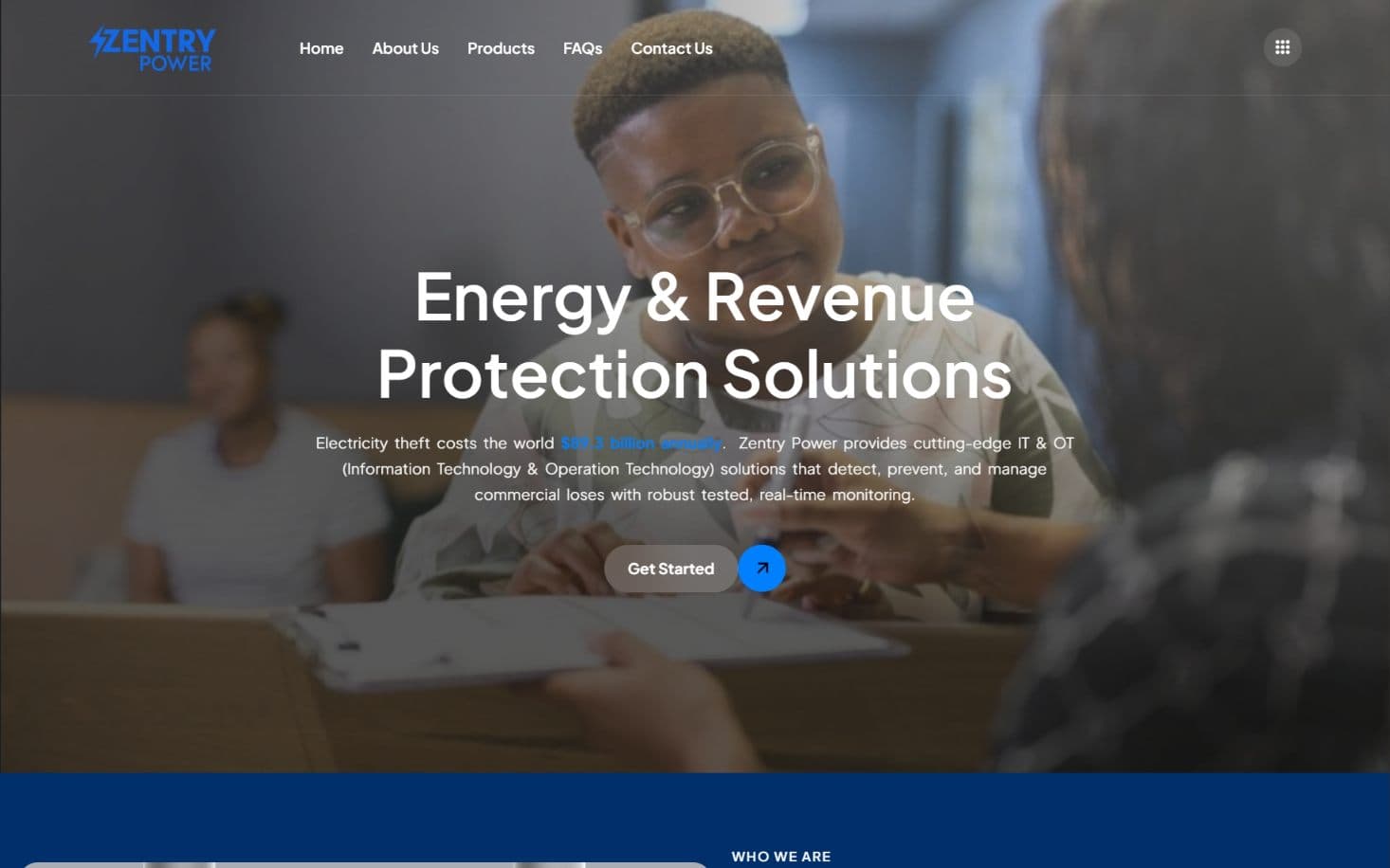
A confident corporate treatment: full-bleed photography behind a clear headline, a restrained blue palette carrying the brand, and generous spacing so that technical content stays readable.
Emphasis is used sparingly, which is what makes it work. When almost nothing is highlighted, the highlighted figure actually registers.
Development
Built on WordPress with reusable patterns for the repeated structures (product entries, feature blocks and FAQ items) so the range can be extended without a developer rebuilding a layout each time.
- WordPress build with reusable content patterns
- Product and FAQ structures the team can extend
- Responsive layouts across phone, tablet and desktop
Technology
Stack
- WordPress
- HTML
- CSS
- JavaScript
- PHP
Services delivered
- Website Development
- UI/UX Design
- Responsive Design
- SEO
Optimization
Large background photography was compressed and served responsively so the visual impact does not cost mobile load time. Page structure was kept semantic, with per-page titles and descriptions written rather than templated.
Outcome
The company has a site that explains a specialised offering without requiring a sales conversation first. Verified traffic and enquiry data will be published here once measured.
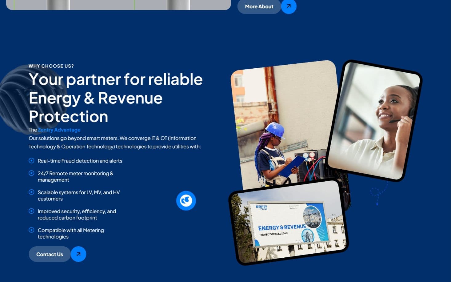
Screenshots
Captured from the live site.
Lessons
For technical products, the FAQ page is not filler. It is where the real objections live. Writing it properly surfaced questions that then belonged higher up the site entirely.
Merryland High School Katabi
A school website built around the questions parents actually arrive with: admissions, academics, contact and credibility.